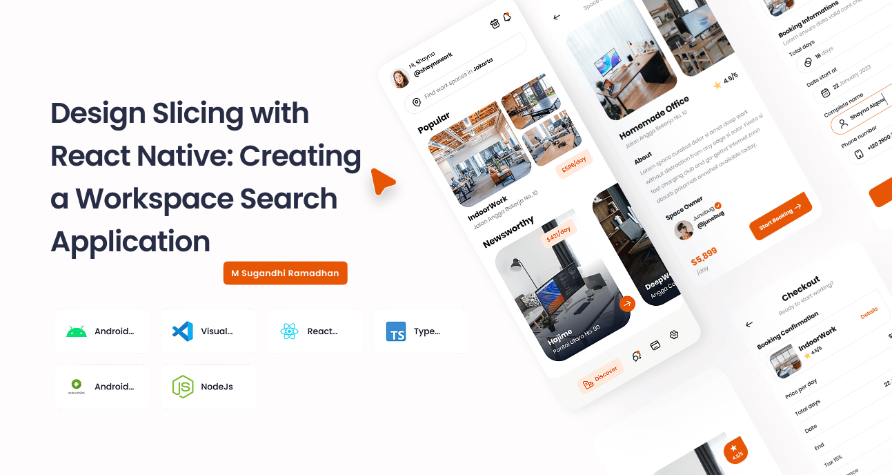
Case Study: Design Slicing with React Native: Creating a Workspace Search Application
This case study documents a personal project focused on translating a high-fidelity Figma design for a workspace search application into a functional mobile interface using React Native. As a UI/UX designer, my primary goal was to explore the "slicing" process deconstructing a visual design into coded, reusable components to better understand the bridge between design and development.
Product User Challenges
For modern professionals like freelancers, remote workers, and digital nomads, finding a suitable temporary workspace comes with several challenges:
Information Overload & Scarcity: Professionals spend significant time searching scattered sources online or physically exploring locations, with no guarantee of finding a suitable spot.
Lack of Price Transparency: Many booking platforms have hidden fees that only appear at checkout, leading to frustration and abandoned bookings.
Complicated Booking Process: Cumbersome and lengthy booking procedures create a poor user experience and act as a barrier to securing a space quickly.
Uncertainty of Quality: Users often feel anxious about the actual quality, amenities, and reliability of a workspace seen only in pictures.
Unique Features
To address these challenges, the application design, as seen in the provided UI screens, incorporates several unique features:
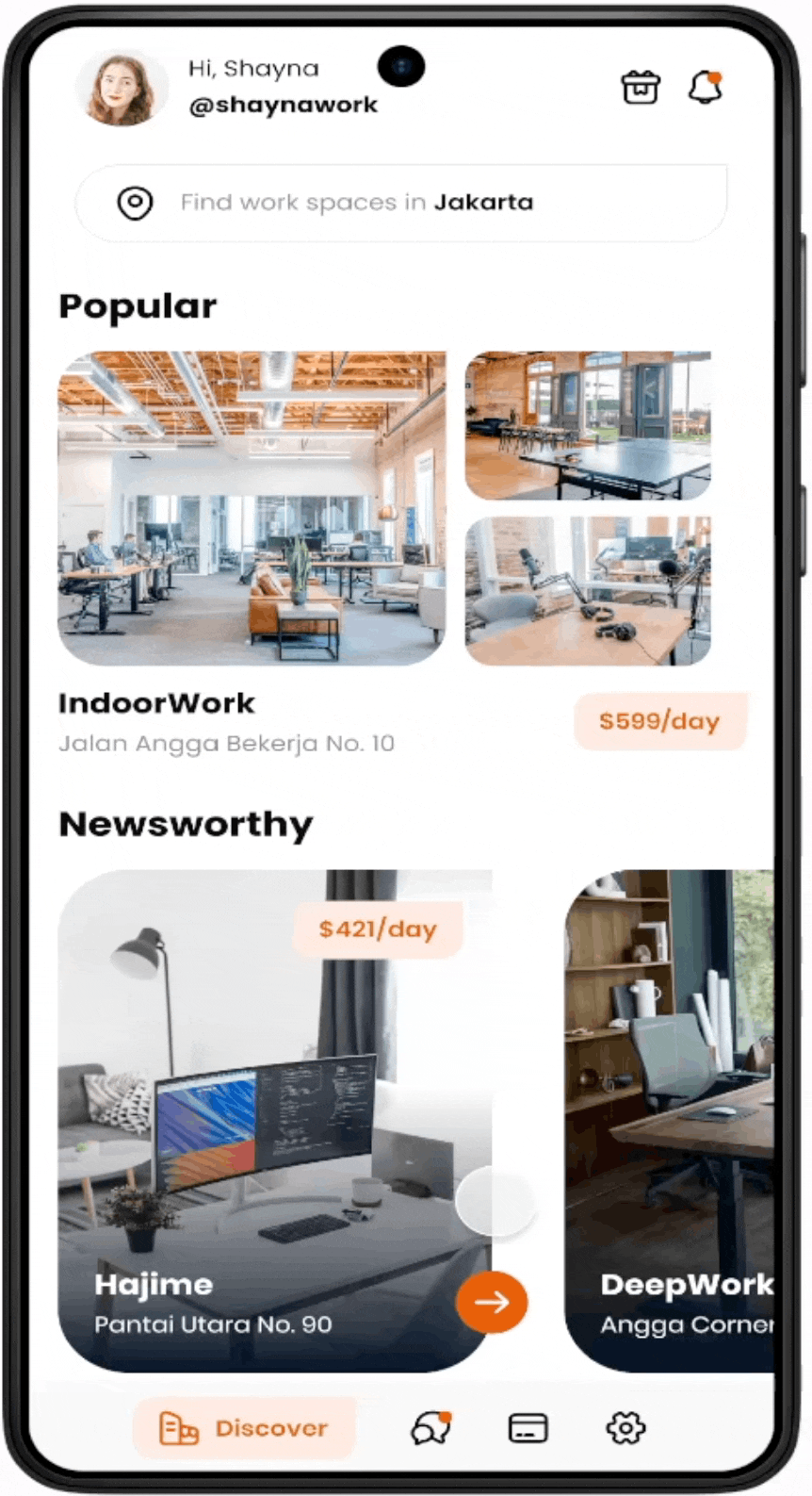
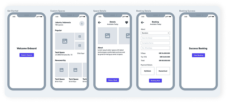
Curated Visual Discovery: The home screen immediately engages users with "Popular" and "Newsworthy" sections, using high-quality images and clear pricing to facilitate quick, visually-driven decisions.
Transparent Cost Breakdown: The checkout screen provides a detailed and transparent summary of all costs, including daily rates, taxes, and insurance, eliminating surprises and building user trust.
Streamlined 5-Step Booking Flow: The entire process, from discovering a space to receiving a booking confirmation, is designed as a seamless and linear journey, minimizing clicks and cognitive load.
Verified Owner Profiles: The details page includes a profile of the "Space Owner," adding a layer of authenticity and personal connection that enhances user confidence in the booking.
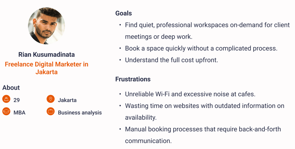
User Persona
To ground the design process, a user persona was developed:
5 Whys Analysis
To understand the core problem, a 5 Whys analysis was conducted.
Problem: Rian struggles to efficiently find and book a suitable workspace for the day.
Why? He lacks a single, reliable platform to view and compare available options in his area.
Why? Information about workspaces is fragmented across individual websites, social media, and Google Maps, with no standardization.
Why? This fragmentation makes it impossible to easily compare crucial factors like price, amenities, and real-time availability.
Why? The booking process on these fragmented channels is often manual, requiring phone calls or WhatsApp messages during business hours.
Why? (Root Cause): There is an absence of a dedicated, user-centric digital marketplace that aggregates on-demand workspaces and streamlines the entire booking process from discovery to payment.
Root Cause Analysis (RCA)
The root cause identified above can be broken down further:
The Problem: Lack of a streamlined, trustworthy digital marketplace for on-demand workspaces.
Contributing Causes:
Process: Existing booking methods are inefficient and manual. There is no standardized process for listing or booking spaces.
Technology: Individual space owners lack the technology for real-time inventory and payment management. There is no central aggregation platform.
Information: Data regarding pricing, amenities, and availability is often inconsistent, inaccurate, or difficult to find.
My Role & The Slicing Process
As the UI/UX designer on this exploratory project, my role was to take the static Figma design and bring it to life in a mobile environment. This involved the practical process of "design slicing" and implementation using a modern tech stack.
Objective: To translate the visual and interaction design from Figma into a functional, component-based application using React Native.
Design Tool: Figma
Code Editor: Visual Studio Code
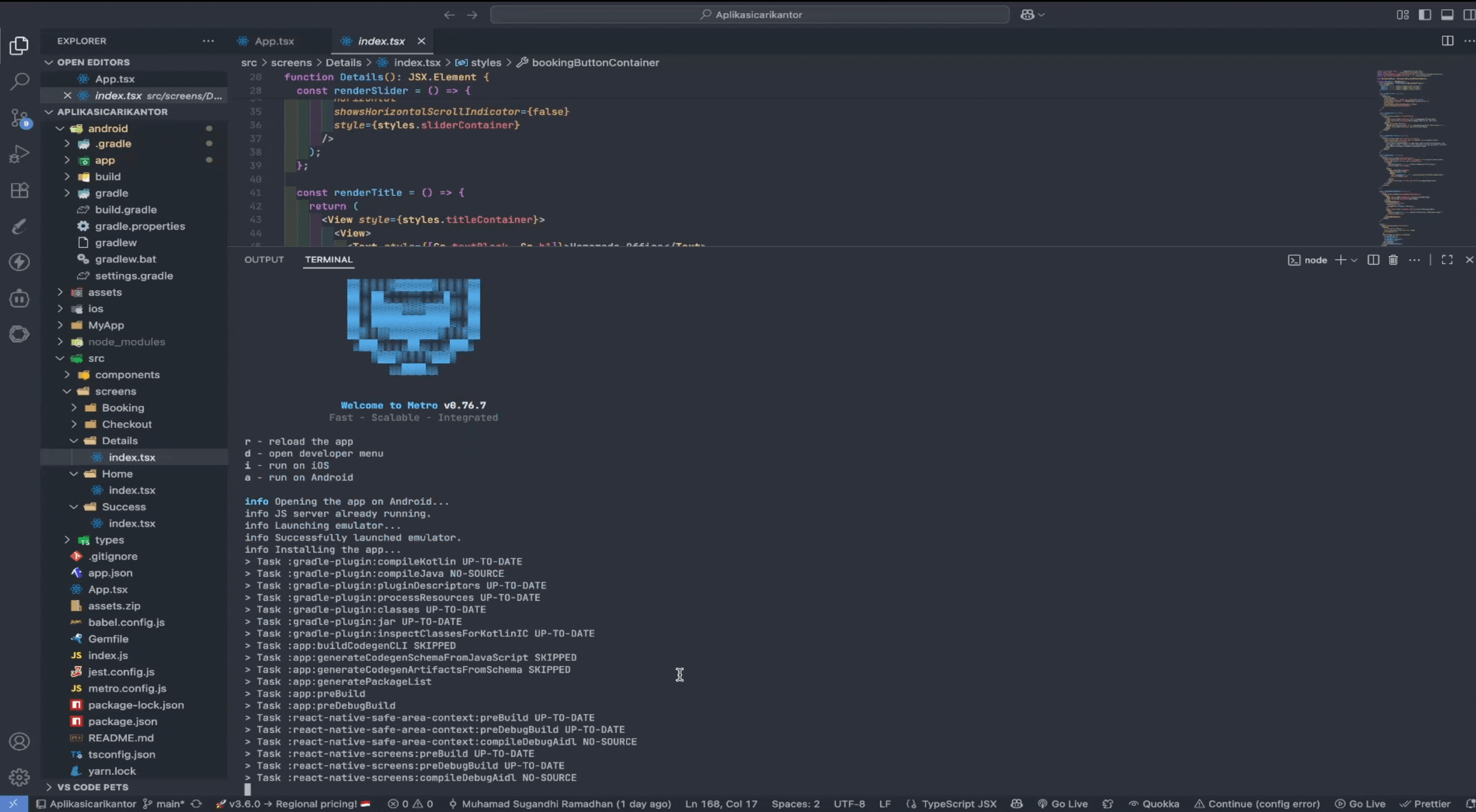
Core Framework: React Native with TypeScript for type safety.
Runtime Environment: Node.js for running the Metro bundler.
Target Platform: Android, utilizing the Android SDK and emulators for testing.
The Tech Stack:
The Slicing Workflow:
Component Deconstruction: I began by analyzing the Figma screens and breaking down the UI into a library of reusable components. This included creating components like WorkspaceCard, BottomNavBar, BookingForm, and PriceDetailRow.
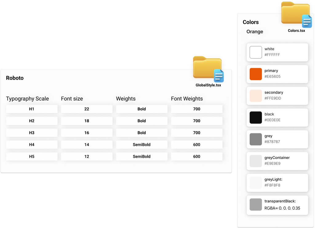
Style Translation: Using React Native's StyleSheet, I translated the design system (colors, typography, spacing) from Figma into global style definitions, ensuring brand consistency across the app.
Navigation Implementation: I mapped out the user flow seen in the images (Discover → Details → Booking → Checkout → Success) and implemented it using the React Navigation library.
Build and Test: The entire application was built and debugged for the Android platform. This involved using the Android SDK to run the app on a virtual device and ensure the sliced components rendered and functioned as designed in Figma.
This project was an invaluable exercise in bridging the gap between design and development. By personally slicing the Figma files into React Native components, I gained a deeper appreciation for how design decisions impact implementation, leading to a more practical and developer-friendly approach to UI/UX design.